Delivery management system
UVA - Dashboard for dispatchers
End-to-End Delivery, From Restaurant to Doorstep
Role:
Senior UX Product Designerr
Collaborators:
Product Manager
Timeframe:
March 2019
Output:
Real-time web dashboard for dispatch coordinators + mobile app for drivers
Overview
UVA is a food-delivery service based in Puerto Rico — think Uber Eats, built for the local market. To keep operations running smoothly, their dispatchers and drivers needed dedicated tools: a real-time web dashboard for dispatch teams to coordinate live orders, and a mobile app for drivers to accept and manage deliveries on-the-go.
I designed both products end-to-end — from user flows and wireframes through to final UI — creating a connected experience that keeps orders moving from restaurant to doorstep.
My Approach
1. Map the Full Delivery Lifecycle
Before designing anything, I mapped every step from an order being placed to it arriving at the customer's door. This gave the team a shared view of the full flow and surfaced every moment where a dispatcher or driver needed to take action — or where things could go wrong.
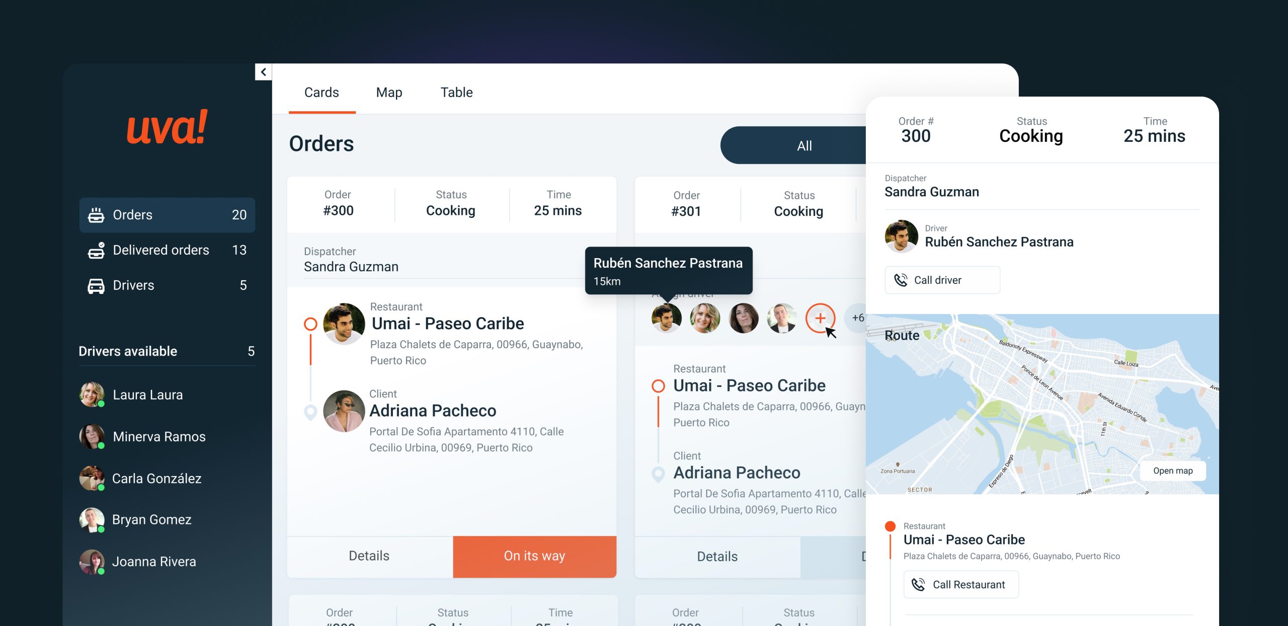
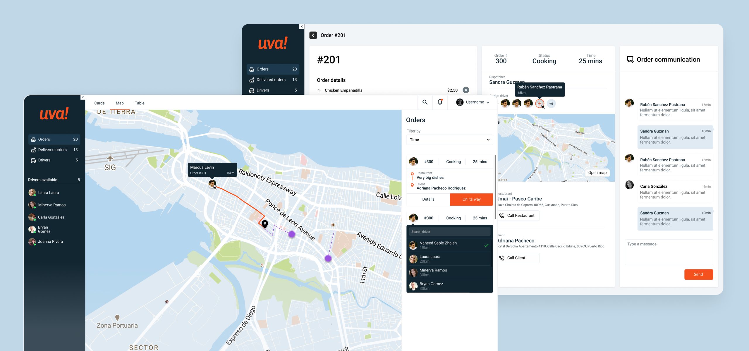
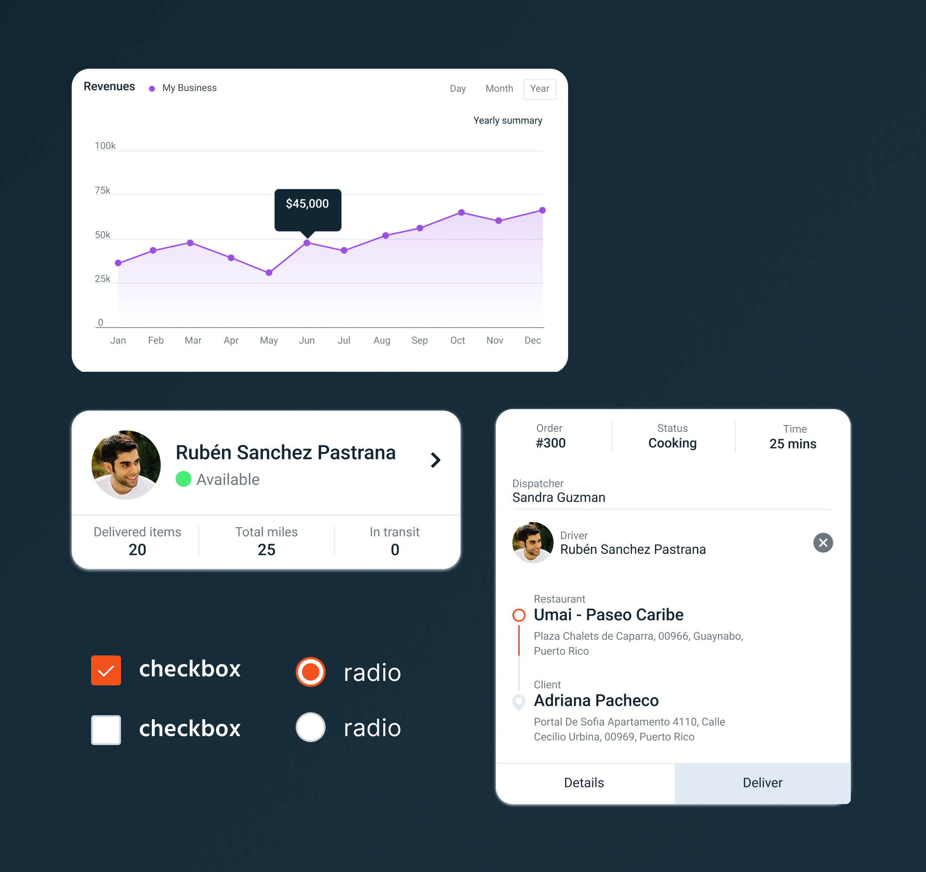
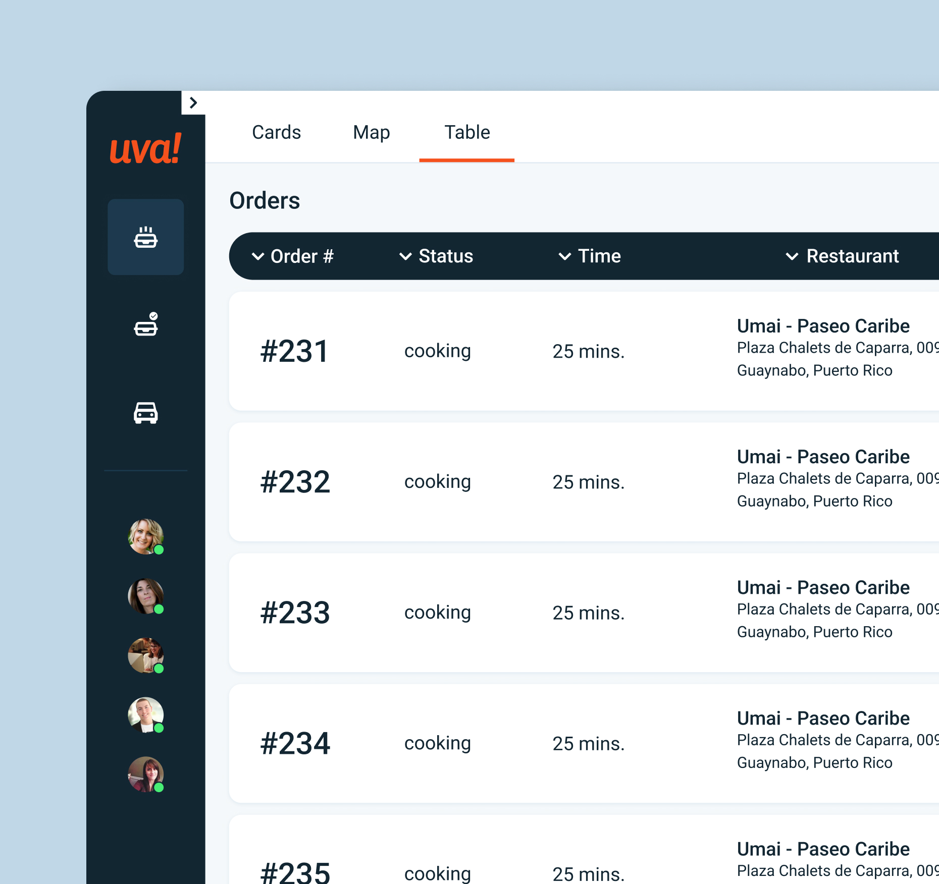
2. Design the Dispatcher Dashboard First
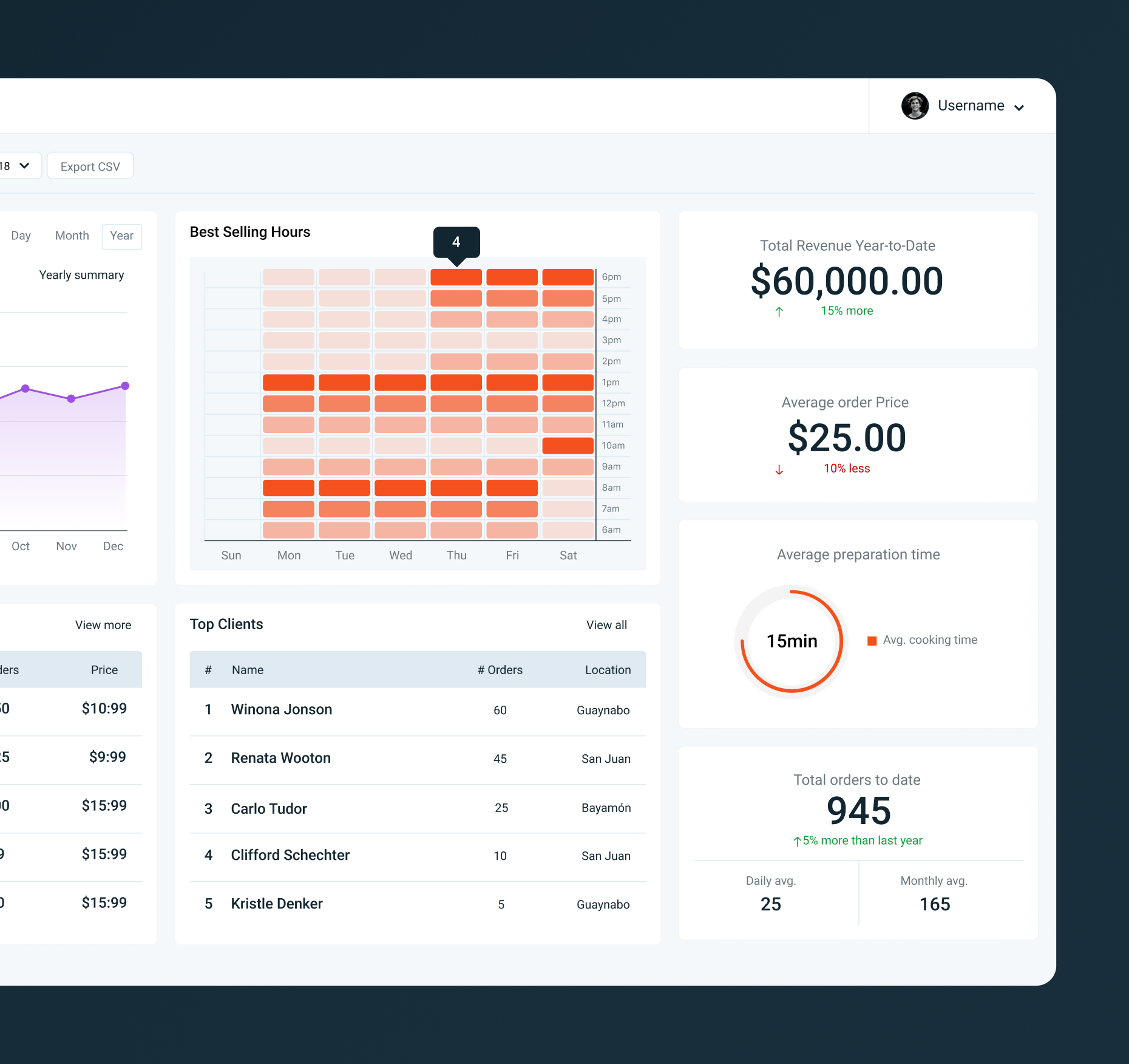
With the full flow defined, I prioritized the dispatcher dashboard as the foundation. Real-time order management, driver availability, and map-based coordination were the core needs. I kept the information architecture focused on the decisions coordinators needed to make quickly, rather than displaying everything at once.
3. Design the Driver App in Parallel
The driver app was built alongside the dashboard, with a deliberate emphasis on simplicity. Drivers need to act fast and often on the move — so the interface was stripped down to what they needed at each step, nothing more. Acceptance, navigation, confirmation: one clear action per screen.
4. Validate Early, Then Move to High Fidelity
Wireframes for both products were reviewed with the team before moving to high-fidelity UI. This kept the design grounded in real operational constraints and gave the PM and engineers early visibility into the direction before we committed to the final visual language..
Summary
The Challenge
Dispatchers were managing a high volume of live orders across multiple restaurants and drivers with no dedicated tool built for that job. Coordinators relied on manual communication, and drivers had no clear in-app workflow to accept, navigate, and confirm deliveries. The challenge wasn't just designing one product — it was designing two interconnected products that could handle real-time pressure without breaking down.
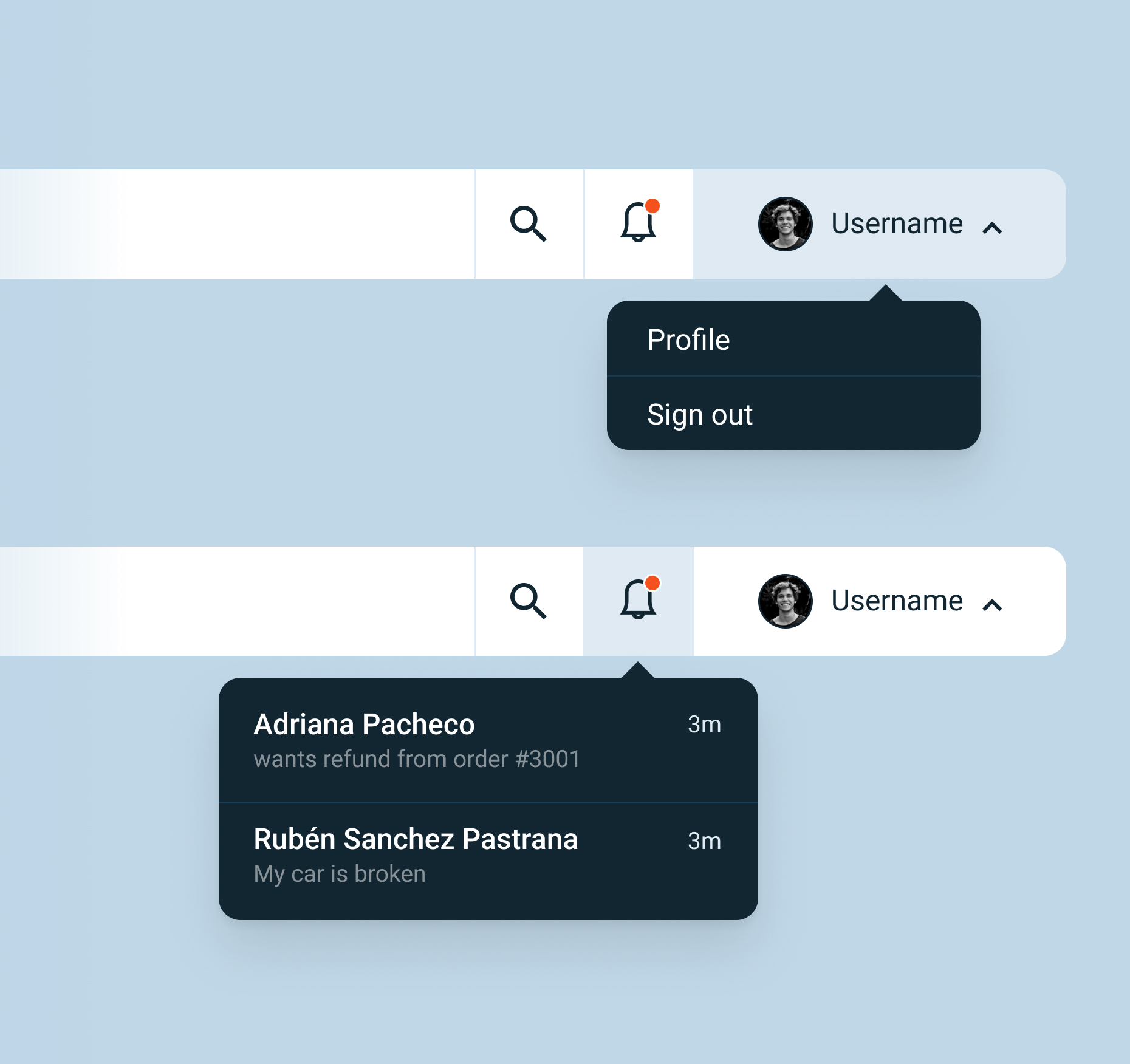
No centralized view for dispatchers. Coordinators had no single place to see order status, driver location, or availability. Decisions were made on incomplete information, slowing down response times and introducing errors during peak hours.
No focused workflow for drivers. Drivers were expected to manage deliveries without a purpose-built tool. There was no guided flow for accepting orders, navigating to drop-offs, or confirming completion — leaving too much room for confusion while on the road.
Fragmented communication across the chain. There were no clear handoff states between restaurant, dispatcher, driver, and customer. Each gap in that chain was a potential point of failure that the team was patching manually, every shift.
Key Challenges
Designing two products as one experience. The dispatcher dashboard and driver app needed to work in sync — what one user does affects what the other sees in real time. This required a tight alignment between the two design flows and constant pressure-testing of the handoff states between them. Every decision on one product had downstream implications for the other.
Keeping the driver app focused under pressure. Drivers use the app while on the road, often in high-pressure moments. The temptation in any product is to surface more information to cover edge cases — but here, more was actively harmful. The real design challenge was deciding what not to show, and trusting that a lean, guided flow would serve drivers better than a feature-rich one.
Impact
Both products launched as core operational tools for UVA's delivery network, and the results were immediate.
Full operational visibility.
The dispatcher dashboard gave coordinators a real-time view of every active order, driver location, and delivery status — something they'd never had before.
Streamlined driver experience.
The driver app turned a previously improvised process into a clear, step-by-step flow for acceptance, navigation, and confirmation.
Faster onboarding across both roles.
The consistent design language across both products reduced the learning curve — new dispatchers and drivers could get up to speed quickly without extensive training..
Reflections
This project taught me a lot about designing for users who are always in motion — both literally and operationally. Dispatchers are making fast decisions with incomplete information, and drivers are executing under time pressure. The design couldn't afford to be ambiguous in either case.
What I'm most proud of isn't any single screen — it's that both products feel like they belong to the same world. That coherence was intentional, and it required holding both user experiences in mind simultaneously throughout the entire process. That kind of systems thinking, applied at the UX level, is what made the final product work.
Thank you for coming over!
Lets Talk!
For collaboration or freelance opportunities, please contact me at alexis.blas@me.com. follow me on LinkedIn.