Design system
System Thinking at Scale
Multi-brand design system for a resume builder platform
Role:
Senior Product Designer — Design System Owner
Collaborators:
Product Manager, Engineers, Design Team
Scope:
3 independent brands, each with its own identity
Output:
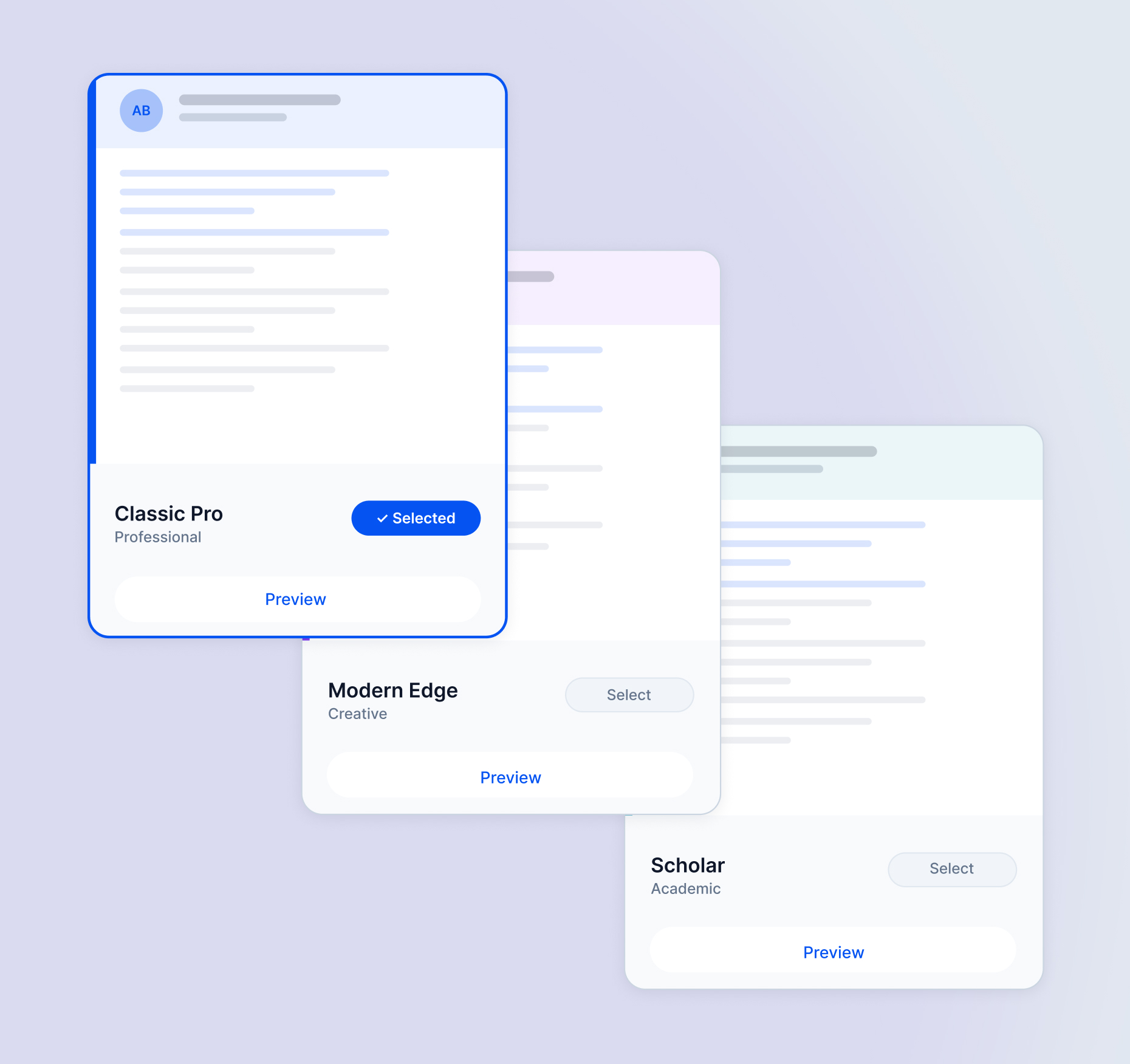
Multi-brand design system with shared token architecture, brand-specific theming, and a unified component library
Overview
When I joined the product team, we were operating three separate resume builder products — each with its own distinct brand identity, design patterns, and visual language. Despite being developed under the same organization, they had no shared foundation. Each had evolved independently, and the lack of a common system was starting to cost us: in velocity, in handoff quality, and in team cohesion.
I took ownership of one of the three products and, recognizing the systemic nature of the problem, led the initiative to build a multi-brand design system from the ground up — one that could serve all three products without erasing what made each brand unique.
My Approach
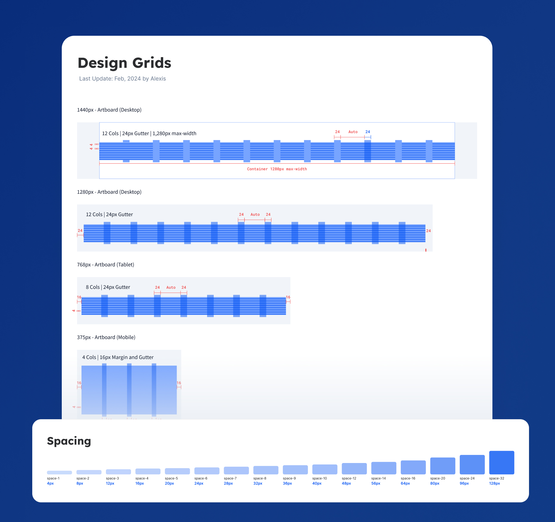
1. Audit First
I reviewed design files and live production sites for all three products, cataloging UI patterns, color usage, typography, and spacing. This revealed what was worth standardizing, what were intentional brand differences, and what was just nois
2. Align on Brand Foundation
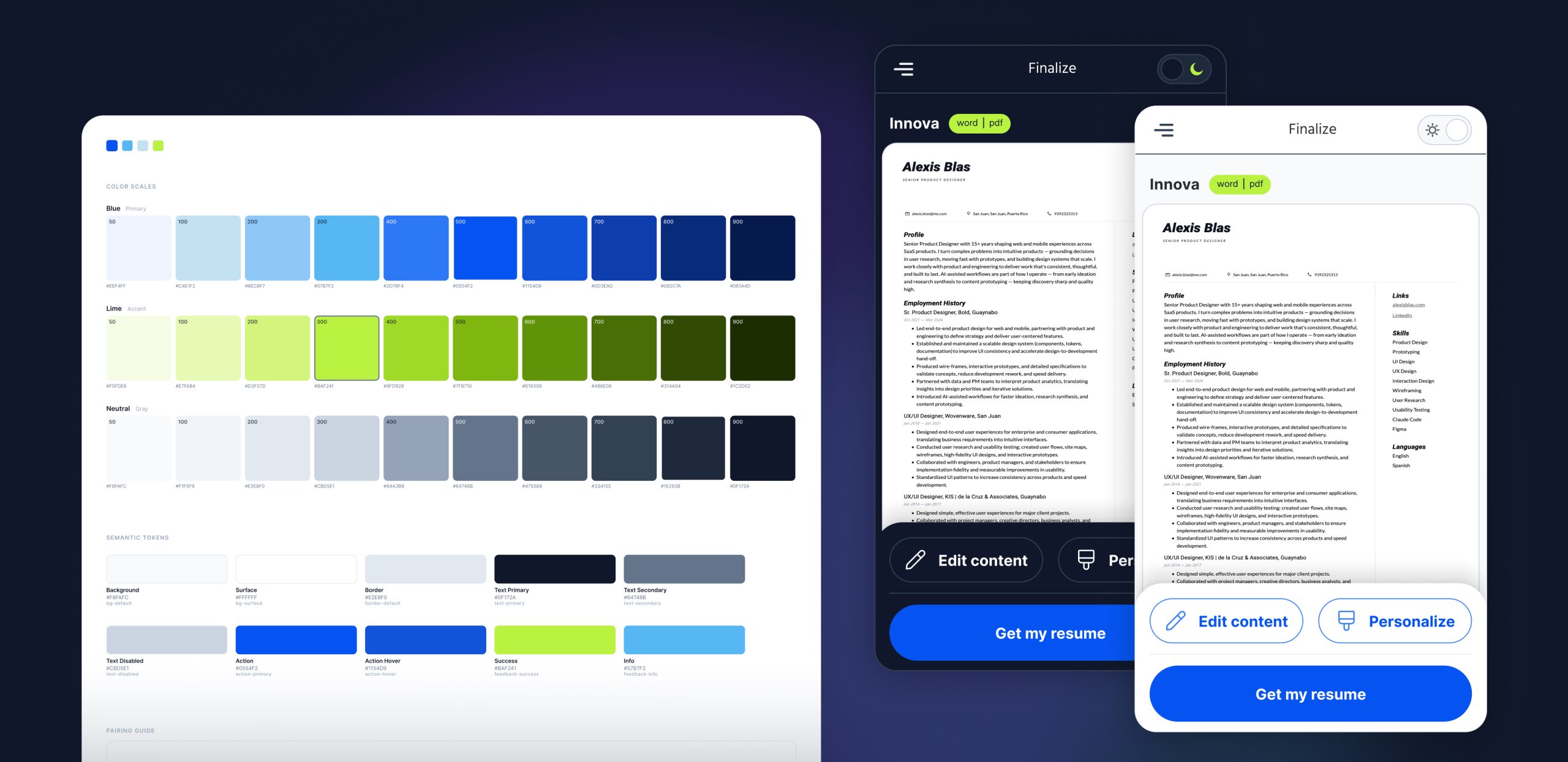
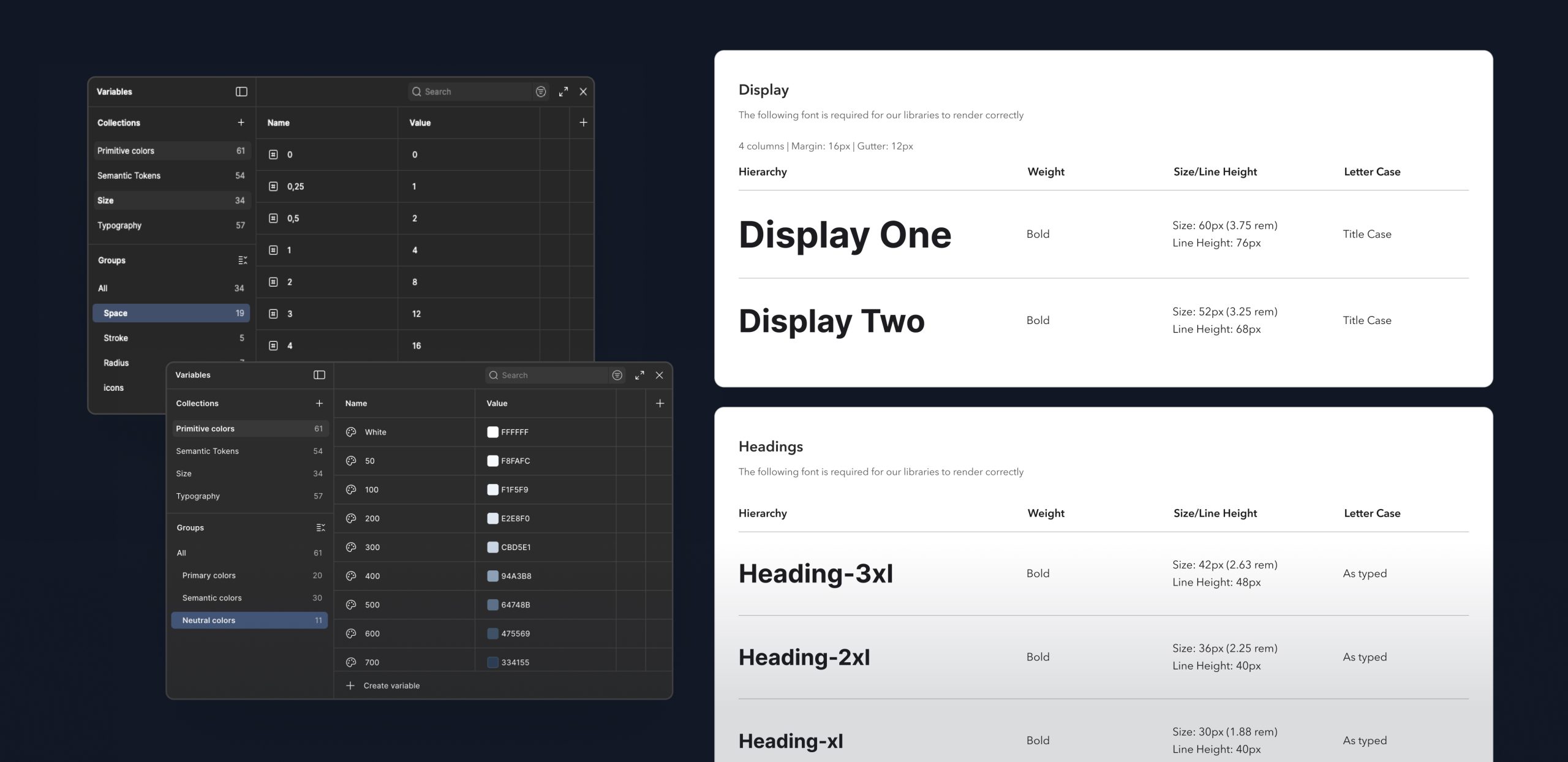
I collaborated with the design team to define core design tokens — color, typography, spacing, and elevation. We structured them in two layers: a global foundation shared across all brands, and brand-specific aliases so each product kept its own identity.
3. Build Components Collaboratively
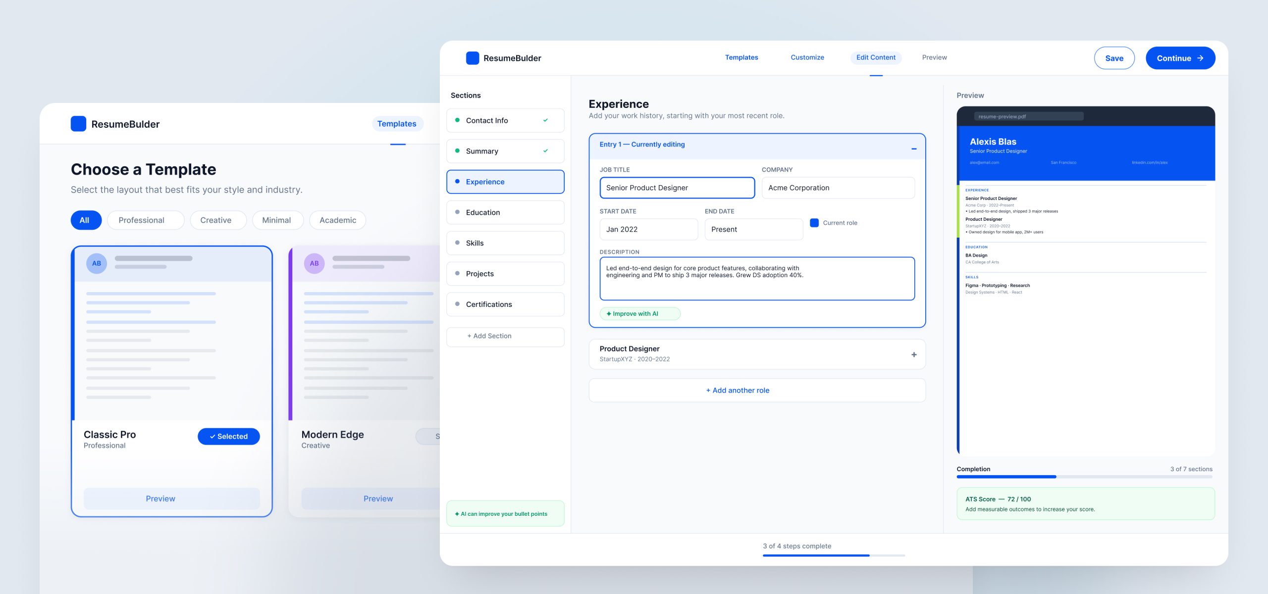
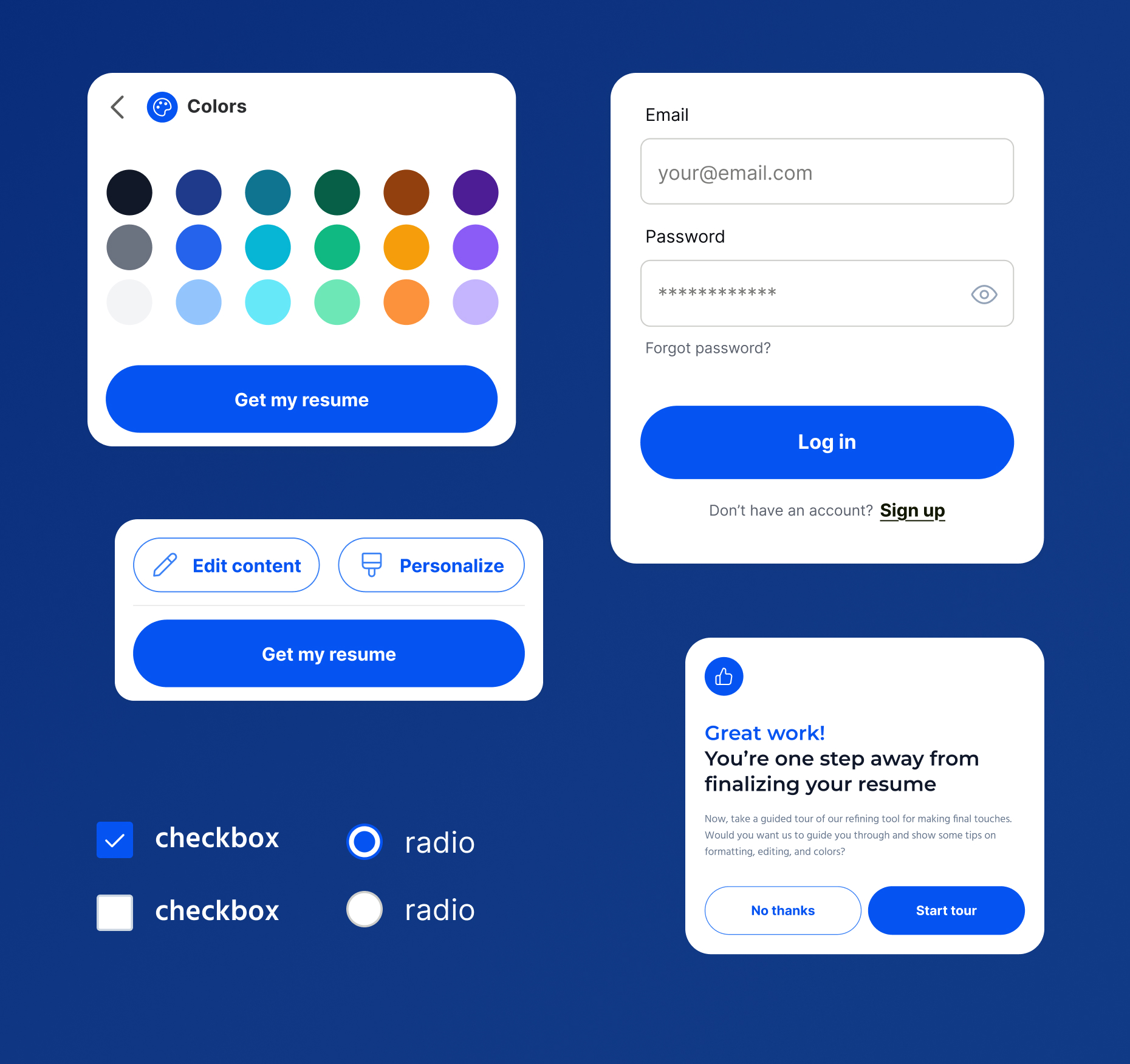
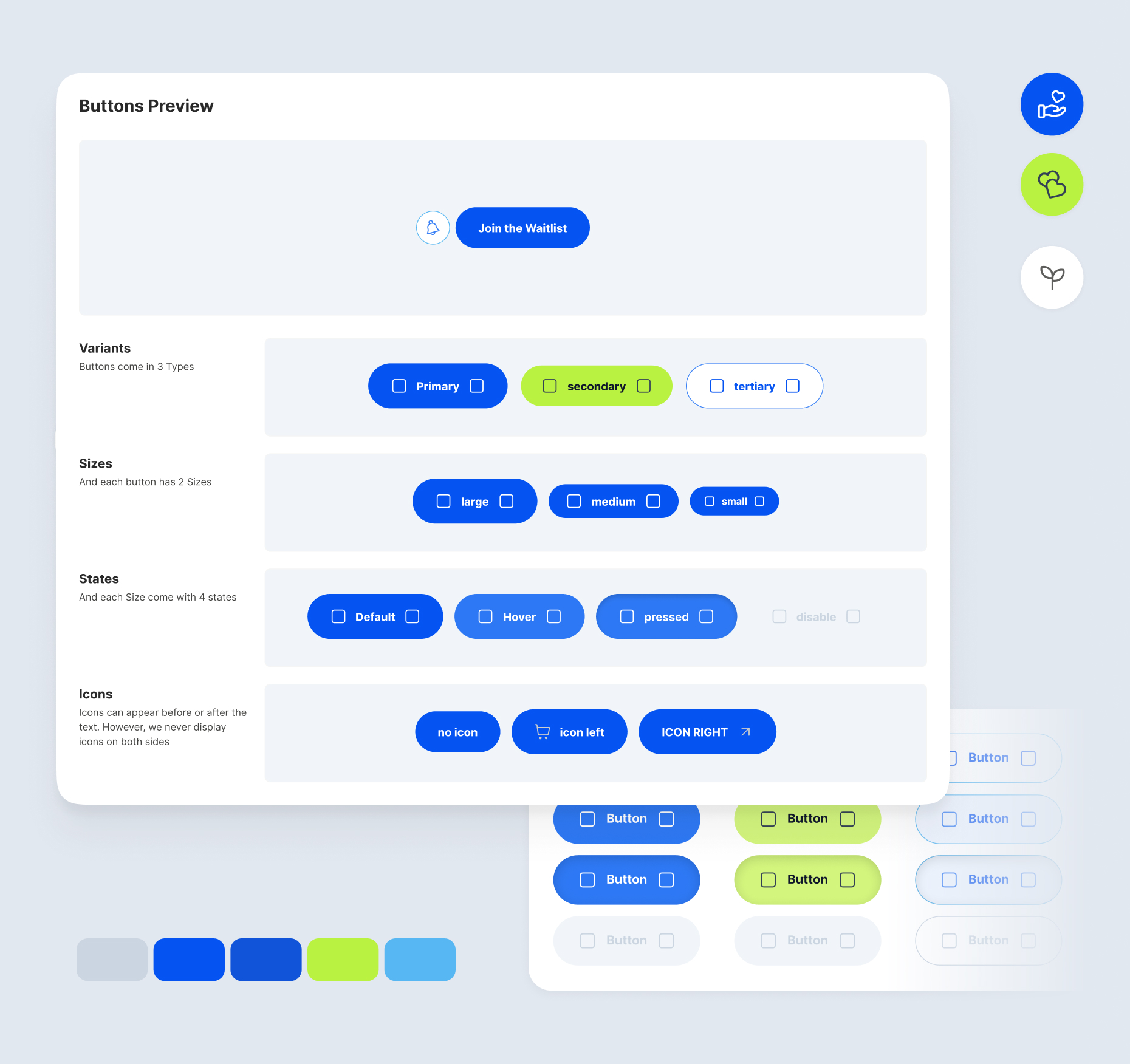
I built the component library starting with the highest-frequency patterns. PMs validated against real product needs; developers were involved early to ensure components mapped to how they built in code.
4. Drive Adoption
Building the system was only half the challenge. The other half was getting the team to use it.
Summary
The Challenge
Without a shared system in place, our team faced three compounding challenges:
Visual inconsistency across brands. Each product had drifted into its own design patterns over time. Buttons, typography, spacing, color — none of it was aligned. Users moving between our products encountered jarring inconsistencies, and our brand perception suffered for it.
Broken design-to-development handoff. Designers and engineers were speaking different languages. Without shared components or agreed-upon specifications, every handoff was a negotiation. Developers were making judgment calls to fill in the gaps, and QA cycles were growing longer as a result.
Duplicated effort across the design team. Each designer was solving the same problems in isolation — creating their own versions of the same UI patterns with no shared foundation to build from. It was slowing everyone down and making design reviews harder to align on.
Key Challenges
Getting designers on board. With three distinct brands in play, the concern wasn't abstract — designers genuinely worried that a shared system would flatten their brand's identity. I addressed this directly: the system wasn't about making everything look the same, it was about building a solid foundation so each brand could invest its creative energy where it mattered most. The two-layer token structure (global foundation + brand-specific theming) was central to making that case concrete. Showing early wins — faster component builds, cleaner handoffs — helped shift skepticism into adoption.
Aligning with engineering. Developers had their own ways of doing things, and introducing a design system meant asking them to change their workflow. I invested time in understanding their constraints — how components were structured in code, what naming conventions made sense to them, and where the biggest handoff pain points lived. By making developers collaborators rather than recipients, we built something that actually mapped to how they worked.
Impact
The design system became a shared foundation that all three products could build
on — and the results were felt quickly across the team.
Faster delivery.
With a shared library of production-ready components, designers and developers spent less time rebuilding solved problems and more time shipping new value.
Improved handoff quality.
Specifications became clearer, conversations became shorter, and the gap between design intent and built output narrowed significantly.
Cross-brand adoption.
Designers across all three products adopted the system — a signal that it was genuinely useful, not just a top-down mandate.
Reflections
This project reinforced something I believe deeply as a designer: the best systems work isn't about the components — it's about the people. The audit, the token architecture, the component library — those were the craft. But the real work was building trust with teammates who had legitimate concerns, and showing that a shared system could make everyone's work better, not just more uniform.
The skills I relied on most weren't Figma skills. They were communication, facilitation, and the ability to make a compelling case for change to people who had every reason to be skeptical.
Lets Talk!
For collaboration or freelance opportunities, please contact me at alexis.blas@me.com. follow me on LinkedIn.